Posted April 5, 2017
The alphabet of social justice
A Tyler School of Art class was challenged to create social justice-themed posters for each letter of the alphabet. They’ll now be displayed on campus.
Photography By:
Betsy Manning
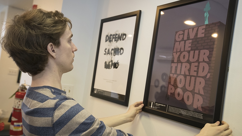
Junior Craig Moscony, one of 13 students who created the social justice posters, helps install the collection in Temple's IDEAL office.
If you want to start a discussion about the diverse range of issues that fit into the category of social justice, it might be helpful to start with basics. Like the alphabet.
That’s what Kelly Holohan figured.
After attending a diversity training seminar led by Temple’s Office of Institutional Diversity, Equity, Advocacy and Leadership (IDEAL), the associate professor in Tyler School of Art found the 26 letters to be fitting way to incorporate social justice into her typography class curriculum.
“It just so happened I had 13 students in the class,” Holohan recalled. “I thought, oh that’s an alphabet project. The numbers worked.”
The result was an assignment for her class of graphic and interactive design majors to create a suite of social justice-themed posters in a matter of weeks. Each student drew two letters at random, and then selected a word for each letter and produced a poster showcasing the meaning of that word in a social justice context. In the end, the class created a collection, dubbed “Social Justice From A-Z,” that will now live in a fitting place: the IDEAL office, situated on North Broad Street.
“It’s very good to see students including what’s going on socially in their artwork—to put out there visually for other students to see,” Nu’Rodney Prad, director of student engagement at IDEAL, said last week as a handful of students began affixing their 18-by-24 posters on the walls.
The framed posters were gifted to the office in a sign of appreciation for IDEAL’s role in the project. Prad and other IDEAL leaders attended a critique for the posters several weeks ago, and, as Holohan put it, helped by “really narrowing in on how to communicate the students’ ideas effectively.”
Pressed to name a favorite, Prad demurred. One example became two, which became three.
“I love how the students expressed themselves,” he said. “They cover all sorts of topics—from gender to race to bigotry.”
Junior graphic and interactive design major Luke Harding, of Pottsville, Pennsylvania, was happy to have his work be featured in the IDEAL office.
“I think it’s a good fit,” he said. “It’s nice to get them outside the classroom and use them for what they’re intended for: awareness. I think it gives a bit of longevity to the pieces. These issues aren’t easily resolved.”
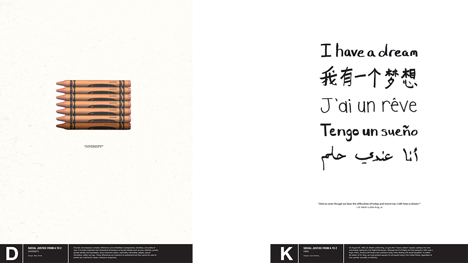
One of Harding’s letters was K, for which he chose “King.” The poster includes text reading “I have a dream,” a phrase then repeated in several languages.
Added Alex Abruzzi, a junior graphic and interactive design major from Slatington, Pennsylvania: “It’s a huge compliment that they came in and loved them...to now have the [posters] live on campus in an environment where they will really shine.”
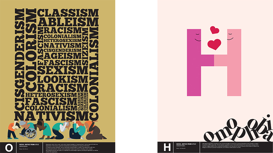
Abruzzi used her O to represent “oppression.” A maze of words—including “racism,” “nativism” and “sexism”—rests on the shoulders of six diverse figures.
"Design activism is a powerful tool in the design profession and this project gave students a chance to engage in that kind of work,” Holohan said. “The faculty are united in our mission to educate our young people...to engage in design for the greater good. It’s actually in our program's mission statement."