Posted February 10, 2009
A passion for printing
Kornberg faculty member’s printing hobby led him to study the life of Frederic Goudy, the man behind the iconic typeface seen in Temple’s logo
|
No matter where you look on campus, you’ll see it. From the cherry red banners celebrating Temple’s 125th anniversary to Temple business cards and stationary, the Goudy™ Old Style typeface has a strong presence at Temple. And Dan Boston, chair and Laura H. Cornell Professor of Restorative Dentistry at the Kornberg School of Dentistry, has become Temple’s resident expert on the typeface and Frederic Goudy, who designed it in 1915. “The interesting thing about Goudy is that he hand-lettered the individual characters himself,” says Boston. “So each letter has a slightly unique personality. Each of the serifs (the feet on the ends of the letters) is slightly different. But it’s a very clear and easy to read font.” One of the most popular typefaces for printers, it’s a natural fit for Temple because each of the “j”s and “i”s are dotted not with round periods, but diamonds. So how exactly did a dentist become interested in printing? Boston’s passion originated in high school, when he ran his own printing business, making flyers and greeting cards for people in his neighborhood. |
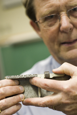 Photo by Ryan S. Brandenberg/Temple University
Daniel Boston's passion for printing led him to study the life and work of
Frederic Goudy, whose Goudy Old Style typeface (shown above) is featured in Temple University's logo. |
|
“In those days, you had to carefully choose the font to do your printing, because if you didn’t like it, you had to physically change it,” says Boston. “And with letterpress printing, every size, style and punctuation mark is a different set of cast lead pieces. It’s not like today where you can just highlight a passage on your computer and change the typeface or size with the click of a button.” |
|
|
Temple's logo is a combination of the Temple "T" symbol and the wordmark (set in Goudy and Goudy SC).
|
To do his printing, Boston chose the Goudy Old Style font because of its distinct look. As he progressed through school and his career as a dentist and educator, he kept up his printing as a hobby, and started researching more about the man behind the letters. “Goudy was a most interesting artisan, not only because he is America’s most |
|
prolific typographer, but because he worked in both the artistic fine press movement of his day and also the highly competitive world of commercial printing,” said Boston. “His books, articles and many tributes document these lasting contributions and are easily appreciated today.” “It’s interesting that Temple chose this font to use on all of its materials,” he said. “Its image might be totally different if the powers that be had chosen a different type.” |
|