Posted December 12, 2012
Relaunched Temple website brings user-focused design, mobile compatibility
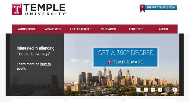
The new www.temple.edu webpage is optimized for viewing on a mobile phone or tablet.
Prospective students, parents, alumni and the broader community will now have easier access to the information they are seeking about Temple with today's launch of a newly redesigned website at www.temple.edu.
"The new site applies the latest thinking about web development and user-centered design," said Nicole Naumoff, associate vice president of University Marketing and Advancement Communications. "It's also ADA compliant and features responsive design, which means that if you are viewing the website on a mobile phone or tablet the website adjusts accordingly."
Driving the new website is a content management system using Drupal 7, an open source system that simplifies making updates, ensuring the content remains fresh, Naumoff explained.
"Temple is a high-quality institution, and it deserves a website that illustrates that quality," she said. "Our website’s home page is where we make our first impression with our most important audiences. We need to always look our best and perform up to people's expectations."
While many of the features on the former site carry over, the new design means those features are in new locations. The page was tested with groups as it was being refined, but Naumoff says feedback is still needed. Comments about the new site can be shared by email to electroniccomm@temple.edu.
"This effort was led by the Web Marketing and Development team in University Marketing. It was truly a collaboration that gathered input from the Provost’s Office and faculty, with support from University Communications and Computer Services," said Naumoff. "I want to thank and congratulate everyone who worked so hard on this project over the last year."