Posted April 1, 2018
How the Temple “T” came to be
The history of the university’s iconic logo is rooted in student innovation and success.
Photography By:
Betsy Manning
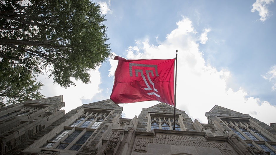
The "T" is universally recognized as the iconic symbol of Temple University.
More than 30 years ago, a group of students from Tyler School of Art took a deep breath before walking into a presentation that would forever change their lives and Temple University itself.
Current President Richard M. Englert was there, in an executive administrator role. Then President Peter Liacouras was there, too. It was 1983, and there was an exciting topic on the meeting agenda: A new logo for the university.
Several students from a graphic arts and design class worked to create three different options for the new logo to celebrate Temple’s upcoming 100th anniversary. The meeting would decide which design reigned supreme and would become a part of the university’s identity.
We all know which design was chosen.
The Temple “T” represents strength and positive character. Its open ends are symbolic of the free exchange of ideas that is the hallmark of a Temple education. Now, it’s universally recognized as the iconic symbol of Temple University.
“Every time I see it now, I swell with pride. When I see it, I see greatness and excellence and creativity and innovation,” said Englert in his 2016 State of the University address. “Knowing that it was designed by Temple students under the guidance of a Temple professor in a Temple academic classroom in Temple’s nationally renowned art school makes it all the more special.”![]()
CORRECTION: There is an error in the scanned image above. Rosa Broid is the correct spelling, not Rosa Broad.
We all love the Temple “T”. Learn how to love our logo the right way by reviewing our official logo usage guidelines.